Charts - Temperature charts
Introduction
The Temperature charts submodule consists of five charts:
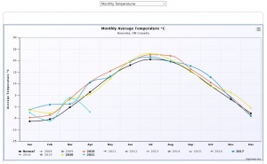
- Monthly Temperatures - Plotting the monthly average temperatures for every year in the dayfile
- Yearly Temperature statistics - Plotting the average, range and standard deviation for for the temperature in every year
- Yearly Temperature statistics per month - Plotting the average, range and standard deviation for for the temperature in each month in every year
- Warmer Days - Plotting the number of days with a temperature higher than 25 °C as stacked column in classes of 5 degree width
- Heatmap - Showing a heatmap chart for all data available
Below you will find an example image of each chart and an explanation of the origin of the numbers
Monthly Temperature
The chart shows the monthly values of the average temperature for each year. The years have a different colour according to the colour scheme. The number of series directly visible is governed by the parameter MaxNrOfSeriesVisibleInGraphs.
If the value of the inifile parameter UseNormalTempReference is Normal the user sees a black line representing the normal average values of the temperature. When UseNormalTempReference is StationAverage the user sees a grey line representing the station average values of the temperature. And obviously when the parameter value is Both, the user sees both lines. In addition to the Station Average Value line, the estimator s for the standard deviation Failed to parse (SVG (MathML can be enabled via browser plugin): Invalid response ("Math extension cannot connect to Restbase.") from server "https://en.wikipedia.org/api/rest_v1/":): {\displaystyle \boldsymbol{\sigma}}
belonging to that line, is always shown as a grey surface with the width of s for a specific month.
Yearly Temperature statistics
For each year the charts shows the average of the daily temperature, the range of the daily temperature and the estimator s for the standard deviation Failed to parse (SVG (MathML can be enabled via browser plugin): Invalid response ("Math extension cannot connect to Restbase.") from server "https://en.wikipedia.org/api/rest_v1/":): {\displaystyle \boldsymbol{\sigma}} belonging to that average. The colours of this chart are hardcoded and cannot be changed. Moving the mouse around provides the specific values in the tooltips.
Yearly Temperature statistics per Month
This chart is similar to the previous one, only now the the user can select a specific month through a row of buttons on top of the chart.
